Case Study – X Factor Romania 2015 App – Second Screen Experience
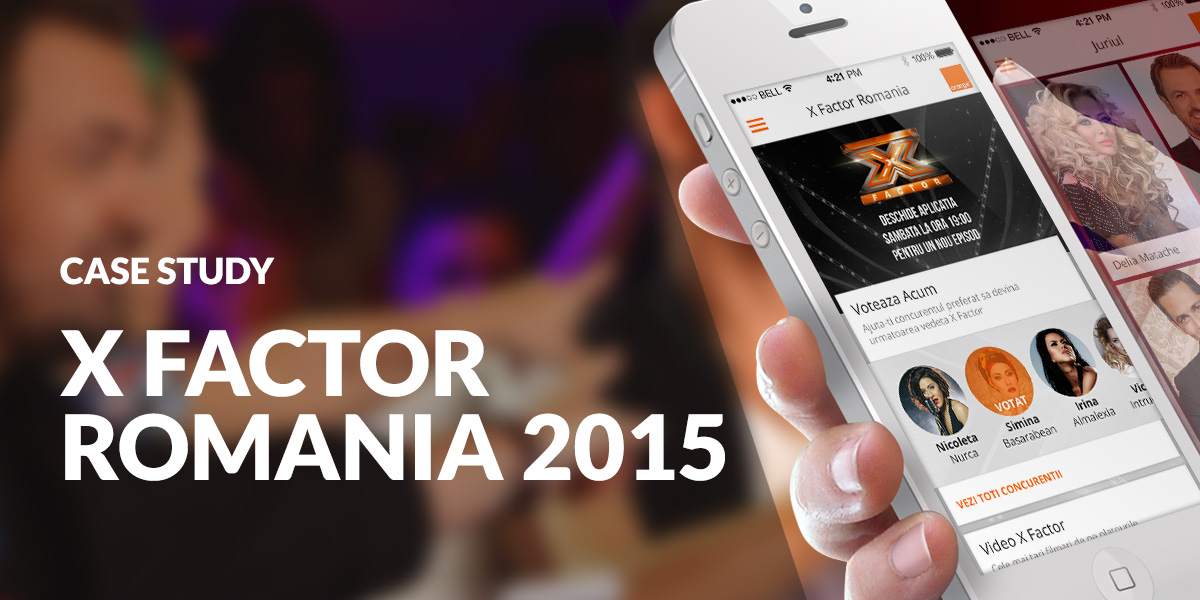
In a previous article, Why You Should Care About Second Screen Experience Apps, we talked about second screen experiences in general, what they are and what their benefits are. In this article we’ll have a look at the second screen experience app mReady has created for X Factor Romania.
You’ll learn a bit about what we did, what went right, what went wrong, potential improvements and why you should care, either if you’re interested in creating a second screen experience app for your company or for someone else.
All second screen experiences need to be integrated with the other parts of the service provided or, in this case, the show. X Factor Romania did this by letting people know that their opinion is just as important as the 3 stars judging the competition.
You are the 4th juror!
How do you get to exercise your right as juror? Simple, you get the app and cast your vote for the contestants you believe deserve it!
That takes us nicely into the reasons the app was created.
Awareness!
We had 4 objectives:
- get people to download the app
- get people to vote
- get people to share their votes
- get people to talk about the show
Let’s talk about numbers and performance indicators real quick. The only objective that the client set for us was that the app should be downloaded at least 10,000 times. It was, it got over 45,000 downloads in the first week and over 145,000 downloads during the following weeks of the show. People using the app also cast over 310,000 votes and shared their votes over 24,000 times on Facebook. In addition to the chatter on social media, users sent over 14,000 messages within the app itself.
Honestly, that last part even we were not expecting.
Maybe some of you are curious how we got the 140,000 downloads.The truth is that having your app mentioned on TV, during prime-time by local celebrities who have key roles in the show tends to do that. Again, great cross promotion between the 2 mediums, the show on TV and the app in your pocket.
The X Factor Romania app was developed for iPhones and Android smartphones only, tablets were out on this one.
What were X Factor’s main app features?
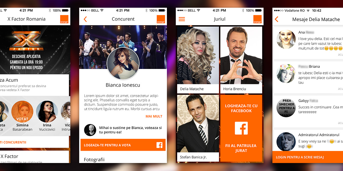
Voting, obviously was a key aspect of the experience. Users would be able to log in via Facebook and feel like they’re on the same level as the 3 other star-jurors (Stefan Banica Jr., Delia Matache and Horia Brenciu). Once logged in, the user could vote for their favorite contestants each week. We had a discussion about whether on not we should limit the number of votes a user could cast each week, and in the end decided that, if they wanted, they could even vote for all the contestants, thus practically nullifying their vote.
Another key feature was the sharing and deep linking aspect of the app, which went hand-in-hand with voting. Each time someone would vote, we would ask them if they want to share their vote on social media or via a message to their friends.
This is where deep linking comes in. Once a user has shared their vote on Facebook, when their friends would tap on the link, they would be directed to the specific contestant page that the original user had voted for. Not only that, but they would also get a reminder that their friend really likes this artist and has voted for them and, perhaps, they should do the same! We were able to do this thanks to the work put in by the people who created Branch. We may come out with an article about how to use deep linking to benefit your company but if you’re interested in learning more right now, go check them out.
We also created a Twitch-like player for the live streaming service. There was a chance that some of the users would sometimes not be able to reach their TVs during the show hours so that app has a live stream feature for the times the show is taking place. This would also act as a reminder for how long until the next show while it was off the air. Thing is, we also wanted people to be able to vote, share or use any other feature of the app while they were streaming the show. We took inspiration from the YouTube and Twitch apps and gave users the option to do just that, they could watch the show and use any other part of the app at the same time.
We also created an in-app messaging system, a sort of chat wannabe. Users could talk about their favorite contestant or juror and all this discussion would be directly linked to the contestant’s or juror’s page.
We’ve learned 2 things from this experience. Always moderate messages! While most of the comments were friendly, every now and again some less than appropriate messages were sent. This becomes even more important if we take into consideration apps that target all age groups. The other thing we’ve learned is that if it looks like a chat app, it should act like a chat app and all messages should be instant.
We had some features that were also available on the website, like access to articles, videos and pictures that would allow users to discover more about the artists and the competition. We’ve also learned another valuable lesson from this:
If you’ve got content created by someone else, make sure it’s properly vetted before giving the app off for approval on the Appstore.
Ours was rejected because of a certain beach-side photo.
Spinoff Apps
If you’ve got the framework… and the backing.
Because of the success of the X Factor app, the client wanted to create 2 additional apps for 2 other shows, with a similar structure.
The first one is Chefi la Cutite (Game of Chefs). The main difference with this app was that users would get a quiz based on the latest episode and if they answered correctly, they’d get the chance to win a prize. In addition to this, they would also get access to a recipe each week through the app.
The second spinoff app is called iUmor (a play on words that roughly translates to “You’ve got humor” or “You’re funny”). The only relevant difference between this app and the X Factor one was that rather than voting, users would get to rate the jokes they heard, using a variety of neon-lit emoticons.
What Went Right
We were also involved in creating the previous X Factor app, a year ago, but only the development part. For this version we got to design the whole product. This brought more coherence and structure to the process of defining the concept, thus helping us deliver a top product in the end.
Bugfixing was quick because of Crashlytics. We had created custom events for whenever the app crashed so we were able to see what caused it and what users were doing with it at the time. We also got notified really quickly when a crash would occur on the Crashlytics dashboard and over email so we had excellent reaction times.
Adding a rating request popup after voting for a contestant was very useful in getting a higher rating score both on the Appstore and on Google Play as well as additional comments and feedback for the app.
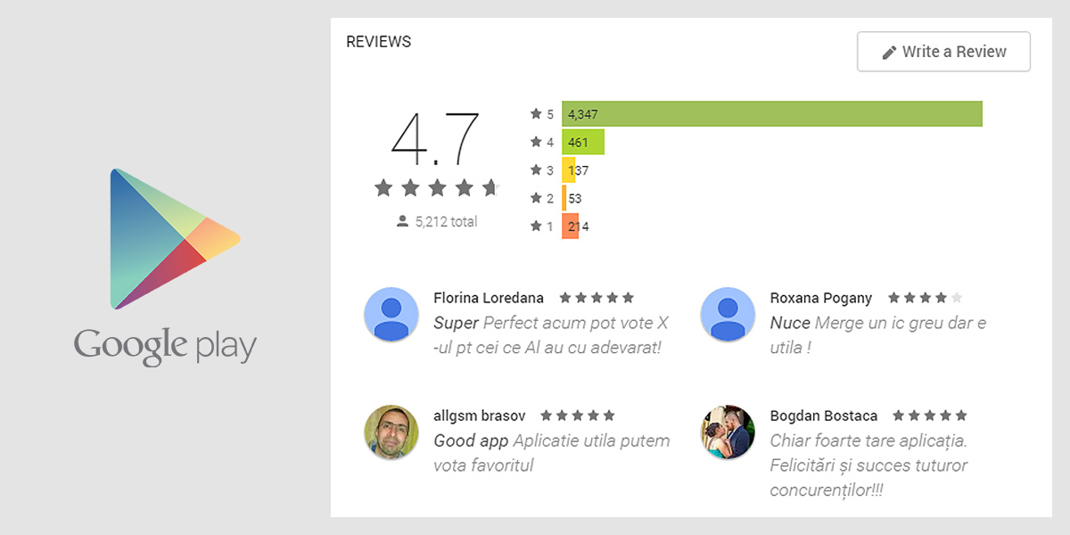
It was very clear when the app would be used, primarily because of the preexisting show schedule, so if something would go wrong, we knew the exact timeframe it could happen and were prepared to react accordingly. In the end, the app got a score of 4.7 on Google Play and over 5200 reviews. Which is fantastic, especially considering that a bug caused it to go town to a 3.6 rating during the first show.
The app got very good promotion during the show, therefore a lot of the viewers were able to download it and use it to vote their favorite contestants.
Releasing the app a little ahead of the scheduled premiere of the show gave us some more time to gather feedback and fix, or change features in order to improve the overall experience.
What Went Wrong
We did get some random server crashes after the initial release but were able to identify the cause fairly quickly. It was a placeholder image (that could have been stored on the user’s phone instead of the server) that was being downloaded far too many times this causing the server to lag or crash. This drove the app review score very low, but we were able to quickly fix the problem and, by adding the rating request after the update, people started enjoying and rating the app up.
- We could have pushed for final copy and visual direction earlier in the process, but we didn’t, and now we are certain to do so for future projects. Some changes from the client came later in the project and consequently created some inconsistencies.
- We did not remove test comments from the messaging system… be sure to always check for that.
- Another thing we underestimated was how much the messaging system would be used. We’ve learned a lot from this experience and we’ll be prepared for the next one.
- Some minor bugs could have been avoided with a little more QA: always make time for more testing.
Final takeaways from Building the X Factor Romania App
- Make time for QA, test as much as possible up to the last second. If you don’t, your users will do it for you and they won’t be happy.
- If a screen in your app looks like chat interface it better act like chat interface, not a forum. This applies to everything you’re creating.
- If you have user generated content, make sure you moderate the content, otherwise you’ll wake up with some unfortunate surprises.
- Work very closely with your clients, bring them in as soon as possible, ask for content as much as you can without pestering and generally make sure you’re on the same page.
- Always check your content, you may be surprised at what can get your app rejected from the App Store
- It’s all complimentary, make sure to tie in the app experience with the TV experience
- Make the people working on a project feel like it’s their project and reward them for doing doing a great job, we’re all much more willing to put in hard work when we’re not just cogs in a machine
- Check out Deep Linking to increase user acquisition and retention – Branch
- Make sure you’ve got a great bug reporting system – Crashlytics
If you found this article helpful, sign up for our newsletter or follow us on Facebook and we’ll let you know when the next one comes out.
If you need help with a mobile project, let us know by either completing the form on our website or by sending us an email at team@mready.net. An if you want to talk about second screen experiences, UX design in general or gamification, hit me up at madalin@mready.net.


1 Response
[…] If you found this article helpful, sign up for our newsletter or follow us on Facebook and we’ll let you know when the next one comes out. Next time we’ll be looking at a case study for a second screen experience app we’ve created for X Factor Romania in 2015. […]