Designer’s Guide: 9-Patch – Why Android Likes Stretching
There are a few different points we’ll be touching on while talking about Android apps. If you’ve ever heard of responsive web design you’re probably going to be familiar with the notion we’ll discuss this week. Yes, it’s 9-patching… and it’s actually much simpler than you’d think… really!
The main idea is that Android powers quite a wide range of devices and most of them have very different sizes, resolutions and aspect ratios. The solution seems quite straightforward, design assets need to either repeat or stretch. Unfortunately applying patterns to certain elements on Android devices seems to be somewhat complicated, not to mention that should you want rounded corners or similar elements, patterns are just not that helpful. You don’t need to worry however because…
Android Likes Stretching
Let’s get into 9-patching, those black lines around certain elements that make them stretch exactly as much as you want them to. Just to clarify, they do need to be black, as in #000000, a dark gray won’t work, I know, I’ve wasted quite a bit of time because of this. There is a 9-patch tool included in the Android development bundle but really, you can add black, 1px lines in anything… even MS Paint.
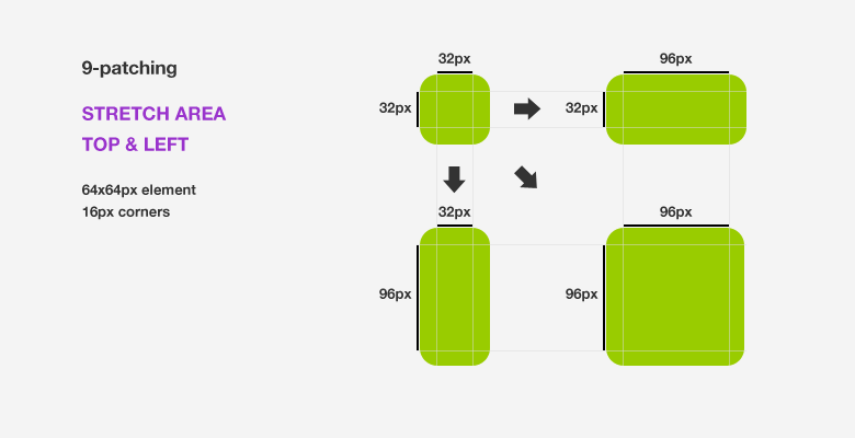
First the off TOP and LEFT lines will determine the area that’s going to stretch so that’s the area that you want to make as small as possible because although it can enlarge, it won’t be able to shrink. These two lines are the bare minimum you’ll need to add to an element, otherwise it won’t be considered 9-patched.
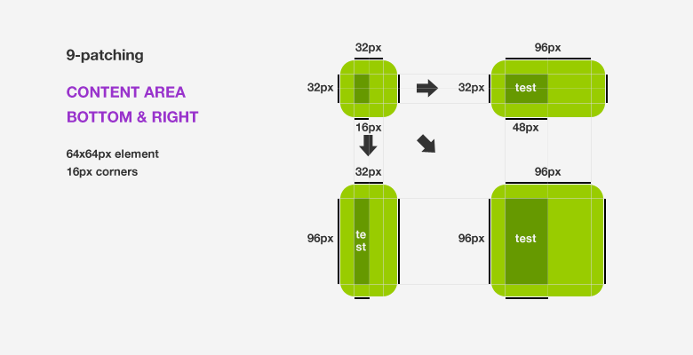
The BOTTOM and RIGHT lines will create a content area that’s going co center anything placed inside it. It’s really helpful is you want to center text on buttons or if you want an icon centered to the left half of the element, for example.
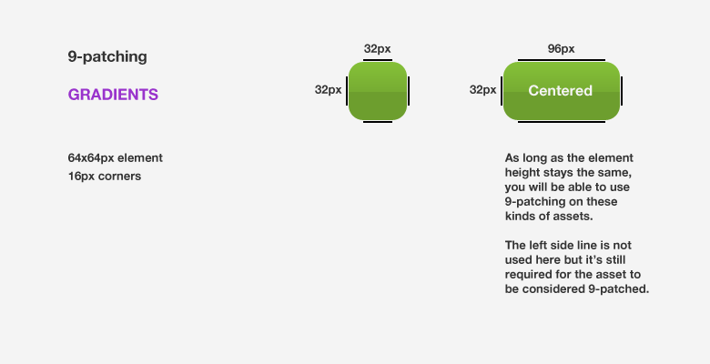
So what about gradients?
Well, you can still use 9-patching on them but, most of the time, they’ll just look wrong. You can however use 9-patching in some cases, like the example below:
Really, that’s about all that you need to know about 9-patching. As long as you remember that the top and left lines will make the element stretch while the right and bottom ones will define a content area inside the element, you’ll be just fine.
You may still want to create different assets for the different DPIs. Check out last week’s article if you want to learn more about the different assets for Android or if you’re just starting out with Android design, it might be useful.
If you want to keep up to date with these guides or just want to see what we’re doing over at mReady, be sure to follow us on Facebook.







1 Response